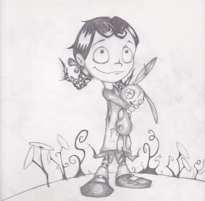
Didn't have much to do the other day so I rendered out a new Myxomatosis picture. I really should do some 3D that doesn't involve these rabbits.
Tuesday, November 23, 2010
Friday, November 12, 2010
Chinese Class Doodles
This is about the extent of my Chinese speaking ability.
Instead of a man on the moon, the chinese have a rabbit on the moon.
Saturday, November 6, 2010
Illustration Method (in 10 steps)
Some people in class asked me how I did my illustrations. My method isn't exactly rocket surgery, and is actually pretty methodical. To whom it may concern, this is pretty much the method I used for every page (although time spent on some pages was more than others).

Step 1: First off was just drawing the bulk of the picture with good ol' paper and pencil. I tend to draw pictures like this with a pacer, which every art teacher I've ever had hates. Hmmm... I just like having a sharp lead for hatching, and forever sharpening a regular pencil wears them down too fast.
Normally if I had time I'd use ink at this point, but there wasn't really time for this project. This alone took anywhere from 4-6 hours
Step 2: Once the picture is scanned into the 'puter, it's just adjustment of white and black levels, and deleting anything that's not the drawing (in photoshop).
Step 3: next, I just duplicate the layer and Gaussian blur it to get some smoother shadow tone.
Step 4: Multiply the blurred layer over the top of the pencil lines.

And then, 8-12 hours later you have your illustration ready for your Indesign layout - not including the 30 - infinite or so hours you will spend nit picking over tiny imperfections.

Step 1: First off was just drawing the bulk of the picture with good ol' paper and pencil. I tend to draw pictures like this with a pacer, which every art teacher I've ever had hates. Hmmm... I just like having a sharp lead for hatching, and forever sharpening a regular pencil wears them down too fast.
Normally if I had time I'd use ink at this point, but there wasn't really time for this project. This alone took anywhere from 4-6 hours
Step 2: Once the picture is scanned into the 'puter, it's just adjustment of white and black levels, and deleting anything that's not the drawing (in photoshop).
Step 3: next, I just duplicate the layer and Gaussian blur it to get some smoother shadow tone.
Step 4: Multiply the blurred layer over the top of the pencil lines.
Step 5: Draw in the pure black that was used in varying ways throughout the book. In this case it was the ground, and a couple of spirally background "trees".
Step 6: digitally paint in the characters' colour. I'm not much of a matte painter, and kind of average with colour as I've said before, so with these pictures I'm relying kind of heavily on my pencil lines. I did some mild dodging and burning on the colour, mainly to just enhance the pencil shading.
Step 7: Most of the colour were just multiply layers on top of the pencil image. The girl's skin was a color layer, as it gave it more of a glow. At this point I burn some of the outer pencil lines to mimic a poor man's "inking".
Step 8: Paint in the backgrounds. This part was what I found looked the most "photoshoppy" in some images. Makes some of the pictures look like desktop backgrounds.

Step 9: Paint in background details, such as clouds. This was about the extent of my matte painting technique.
Step 10: Add some overlapping foreground clouds and some dark green under the character. These are the "grounding" details, which makes the foreground, midground and background all look part of the same image - rather than a bunch of layers on top of each other. This was definitely done better in some images than others.
Step 6: digitally paint in the characters' colour. I'm not much of a matte painter, and kind of average with colour as I've said before, so with these pictures I'm relying kind of heavily on my pencil lines. I did some mild dodging and burning on the colour, mainly to just enhance the pencil shading.
Step 7: Most of the colour were just multiply layers on top of the pencil image. The girl's skin was a color layer, as it gave it more of a glow. At this point I burn some of the outer pencil lines to mimic a poor man's "inking".
Step 8: Paint in the backgrounds. This part was what I found looked the most "photoshoppy" in some images. Makes some of the pictures look like desktop backgrounds.
Step 9: Paint in background details, such as clouds. This was about the extent of my matte painting technique.
Step 10: Add some overlapping foreground clouds and some dark green under the character. These are the "grounding" details, which makes the foreground, midground and background all look part of the same image - rather than a bunch of layers on top of each other. This was definitely done better in some images than others.And then, 8-12 hours later you have your illustration ready for your Indesign layout - not including the 30 - infinite or so hours you will spend nit picking over tiny imperfections.
Labels:
book,
cartoon,
drawing,
girl,
Graphic Design,
illustration,
picture book
Monday, November 1, 2010
My Picture Book Pages (with a bit o' complaining)
Heads up - I've been staring at these images for a long time, so I'm at that stage where I see nothing but problems. Hence, there may be some whinging in this post (plus I'm writing this at about 2 in the morning).
I meant to do more "work in progress" posts, but instead I just went ahead and churned out the entire book as fast as I could. These are the pages as they currently stand (in reverse order of creation). Some images I'm more happy with than others, but... deadline, time limit, 4 weeks, blah blah blah... - they ended up this quality. I'll try to live with it.
Not sure what to put on the back cover so this could definitely be subject to change.


I'm really not happy at how "photoshoppy" some of these pictures look. It's due to the fast noobish digital painting I did. Slightly above MS paint.
Personally I like my drawings to be "cleaner" than this. Normally I'd use ink for outlines and such, but instead I just had to do the quick poor man's version of burning the outer pencil lines in photoshop. Some people may find the scratchy pencil lines "charming", but I think it looks more like a drawing mistake than an intentional style choice.These pictures do make nice thumbnails, though.
I meant to do more "work in progress" posts, but instead I just went ahead and churned out the entire book as fast as I could. These are the pages as they currently stand (in reverse order of creation). Some images I'm more happy with than others, but... deadline, time limit, 4 weeks, blah blah blah... - they ended up this quality. I'll try to live with it.

Not sure what to put on the back cover so this could definitely be subject to change.


I'm really not happy at how "photoshoppy" some of these pictures look. It's due to the fast noobish digital painting I did. Slightly above MS paint.
Personally I like my drawings to be "cleaner" than this. Normally I'd use ink for outlines and such, but instead I just had to do the quick poor man's version of burning the outer pencil lines in photoshop. Some people may find the scratchy pencil lines "charming", but I think it looks more like a drawing mistake than an intentional style choice.At this earlier stage I was spending a bit more time on the backgrounds.
Labels:
cartoon,
colour,
drawing,
Graphic Design,
illustration,
picture book
Tuesday, October 12, 2010
What can be draw in a 1 hour lecture - again.
Sunday, October 10, 2010
Starting a Kid's Book
Now that I've started illustrating the kid's book, I realise how tough it'll be getting all the pages done by the deadline. I would've liked to spend some time experimenting with different drawing styles, but I think I'll just have to use a drawing method that I'm used to, so I can turn out pictures more quickly.
The book is basically about a cuckoo bird that kidnaps a little girl for a bunch of evil faeries, and she then turns into a cat. (That one sentence synopsis probably doesn't do it much justice). It's a rhyming story, so it has set stanzas for each page. For better or worse that means less time spent on text layout. It also has a "gothic" vibe as it's a bit like a Grimm fairytale.
Anyway, first off I have a bunch of rough concepts (no time to clean them up) of the various characters I need. I decided to use the style of drawing I used for Monkey Girl.
.jpg)
Cuckoo bird
This girl's design is a pretty stock "cute" design. I used the same structure for monkey girl, and my anime attempt. (I like to steer clear of anime style, but so many people draw that way, it's starting to subliminally influence me)
The idea behind this cat was a bit of a combo of the cat from Bob the Builder and the one from Kiki's Delivery Service (anime again dammit). Hey, I'm not too proud to say where I steal ideas from (better I point it out than some smug fanboy).

(this faerie character I came up with seems really familiar. I think I've ripped something off without realising it. If anyone thinks these look like something that already exists please tell me)
Usually I'd spend more time fine tuning characters - but not much time. This probably means that the characters will go a bit off model in the book itself. It also means that theideas I steal influences I use will be more obvious. Hopefully it won't be too noticeable.
The book is basically about a cuckoo bird that kidnaps a little girl for a bunch of evil faeries, and she then turns into a cat. (That one sentence synopsis probably doesn't do it much justice). It's a rhyming story, so it has set stanzas for each page. For better or worse that means less time spent on text layout. It also has a "gothic" vibe as it's a bit like a Grimm fairytale.
Anyway, first off I have a bunch of rough concepts (no time to clean them up) of the various characters I need. I decided to use the style of drawing I used for Monkey Girl.
.jpg)
Cuckoo bird
This girl's design is a pretty stock "cute" design. I used the same structure for monkey girl, and my anime attempt. (I like to steer clear of anime style, but so many people draw that way, it's starting to subliminally influence me)
The idea behind this cat was a bit of a combo of the cat from Bob the Builder and the one from Kiki's Delivery Service (anime again dammit). Hey, I'm not too proud to say where I steal ideas from (better I point it out than some smug fanboy). 
(this faerie character I came up with seems really familiar. I think I've ripped something off without realising it. If anyone thinks these look like something that already exists please tell me)
Usually I'd spend more time fine tuning characters - but not much time. This probably means that the characters will go a bit off model in the book itself. It also means that the
Labels:
cartoon,
doodles,
drawing,
Graphic Design,
illustration,
picture book
Sunday, October 3, 2010
Online Design Questions
What is pacing?
Pacing is how you layout elements within an interactive environment, such as a web page, to allow an easy flow of information for the viewer. The idea is to not overwhelm the viewer with lots too much information or too many interactive elements. Otherwise the viewer will just be confused as to where to put their attention. For example if I suddenly gave a bunch of interactive links with no proper layout or relation to each other, it would interrupt the pacing of this post.
True or False: A reader spends more time with a print edition than they do with
an online news presentation.
Apparently, people spend more time reading online news and media than they do with print, despite the stereotypically opinion that web media is just briefly read by people with a quick logon/logoff mentality. (So false)
What are some tools that online designers create in layouts that help readers
remember key information?
In order to keep attention, however, online designers will incorporate many graphical and interactive elements to keep the reader's attention. Q and A forums, graphics, video, "fact" boxes and various Web 2.0 type elements keep people occupied. Print media cannot supply these elements with as much ease or accessibility.
What is the simplicity equation?
In all its simplicity it is:
clear links + identifiable location = happy readers
In other words, keep information and navigation simple. Too many options and people get confused.
What is the first thing someone sees and the most important element of your
site when the viewer first logs on?
The navigation bar is the first thing your viewer will look for and use when they come to your site. It's important that they can clearly understand how to get to where they want and to use the nav bar to get there.
This is much more important than spending too much time creating a dorky rabbit themed title graphic.
answers according to: 'Online Design Basics’
A reading from Downman, Scott (2008) Edit: A Guide to Layout, Design and Publication,
Oxford Press: Sydney
Pacing is how you layout elements within an interactive environment, such as a web page, to allow an easy flow of information for the viewer. The idea is to not overwhelm the viewer with lots too much information or too many interactive elements. Otherwise the viewer will just be confused as to where to put their attention. For example if I suddenly gave a bunch of interactive links with no proper layout or relation to each other, it would interrupt the pacing of this post.
True or False: A reader spends more time with a print edition than they do with
an online news presentation.
Apparently, people spend more time reading online news and media than they do with print, despite the stereotypically opinion that web media is just briefly read by people with a quick logon/logoff mentality. (So false)
What are some tools that online designers create in layouts that help readers
remember key information?
In order to keep attention, however, online designers will incorporate many graphical and interactive elements to keep the reader's attention. Q and A forums, graphics, video, "fact" boxes and various Web 2.0 type elements keep people occupied. Print media cannot supply these elements with as much ease or accessibility.
What is the simplicity equation?
In all its simplicity it is:
clear links + identifiable location = happy readers
In other words, keep information and navigation simple. Too many options and people get confused.
What is the first thing someone sees and the most important element of your
site when the viewer first logs on?
The navigation bar is the first thing your viewer will look for and use when they come to your site. It's important that they can clearly understand how to get to where they want and to use the nav bar to get there.
This is much more important than spending too much time creating a dorky rabbit themed title graphic.
answers according to: 'Online Design Basics’
A reading from Downman, Scott (2008) Edit: A Guide to Layout, Design and Publication,
Oxford Press: Sydney
Subscribe to:
Posts (Atom)