Tuesday, December 7, 2010
a Girl in the Clouds
At first I was trying to do a Jamie Hewlett style character (I know - a lot of people knock off his style), but it inadvertantly ended up looking less like that. I think it's mainly because of my colour pallet and thicker inking.
I'm also getting into the habit of overusing this stock expression. Oh well - at least it's not "tude". At least I don't think it is. Crap - now that I look at it, maybe it is...
Tuesday, November 23, 2010
Gun Slinging
Friday, November 12, 2010
Chinese Class Doodles
Saturday, November 6, 2010
Illustration Method (in 10 steps)
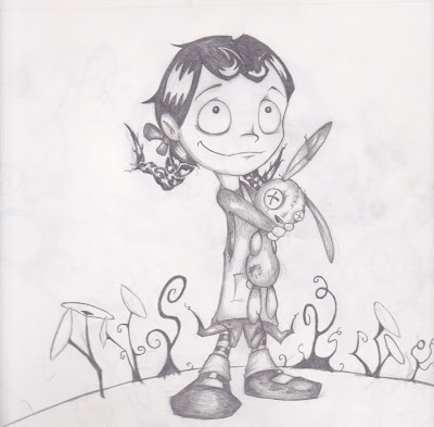
Step 1: First off was just drawing the bulk of the picture with good ol' paper and pencil. I tend to draw pictures like this with a pacer, which every art teacher I've ever had hates. Hmmm... I just like having a sharp lead for hatching, and forever sharpening a regular pencil wears them down too fast.
Normally if I had time I'd use ink at this point, but there wasn't really time for this project. This alone took anywhere from 4-6 hours
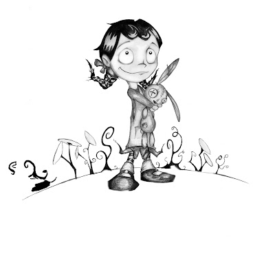 Step 2: Once the picture is scanned into the 'puter, it's just adjustment of white and black levels, and deleting anything that's not the drawing (in photoshop).
 Step 3: next, I just duplicate the layer and Gaussian blur it to get some smoother shadow tone.
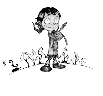 Step 4: Multiply the blurred layer over the top of the pencil lines.
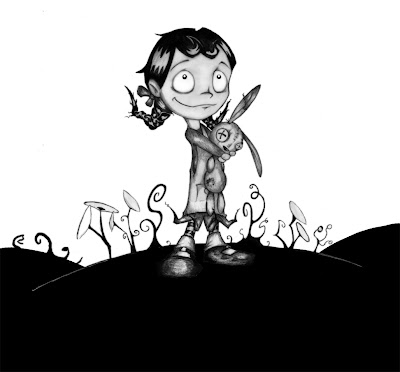
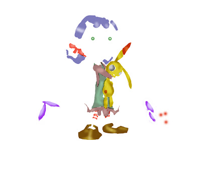 Step 6: digitally paint in the characters' colour. I'm not much of a matte painter, and kind of average with colour as I've said before, so with these pictures I'm relying kind of heavily on my pencil lines. I did some mild dodging and burning on the colour, mainly to just enhance the pencil shading.
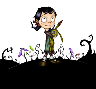 Step 7: Most of the colour were just multiply layers on top of the pencil image. The girl's skin was a color layer, as it gave it more of a glow. At this point I burn some of the outer pencil lines to mimic a poor man's "inking".
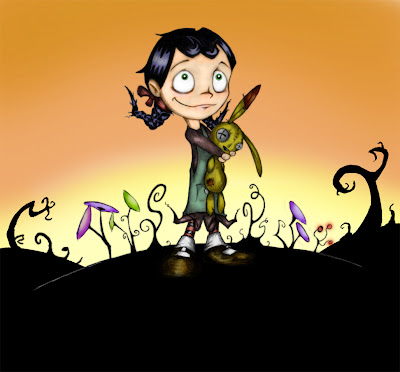 Step 8: Paint in the backgrounds. This part was what I found looked the most "photoshoppy" in some images. Makes some of the pictures look like desktop backgrounds.
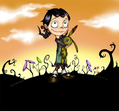
Step 9: Paint in background details, such as clouds. This was about the extent of my matte painting technique.
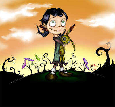 Step 10: Add some overlapping foreground clouds and some dark green under the character. These are the "grounding" details, which makes the foreground, midground and background all look part of the same image - rather than a bunch of layers on top of each other. This was definitely done better in some images than others.
And then, 8-12 hours later you have your illustration ready for your Indesign layout - not including the 30 - infinite or so hours you will spend nit picking over tiny imperfections.
Monday, November 1, 2010
My Picture Book Pages (with a bit o' complaining)
I meant to do more "work in progress" posts, but instead I just went ahead and churned out the entire book as fast as I could. These are the pages as they currently stand (in reverse order of creation). Some images I'm more happy with than others, but... deadline, time limit, 4 weeks, blah blah blah... - they ended up this quality. I'll try to live with it.

Not sure what to put on the back cover so this could definitely be subject to change.


I'm really not happy at how "photoshoppy" some of these pictures look. It's due to the fast noobish digital painting I did. Slightly above MS paint.

 Personally I like my drawings to be "cleaner" than this. Normally I'd use ink for outlines and such, but instead I just had to do the quick poor man's version of burning the outer pencil lines in photoshop. Some people may find the scratchy pencil lines "charming", but I think it looks more like a drawing mistake than an intentional style choice.
Tuesday, October 12, 2010
What can be draw in a 1 hour lecture - again.
Sunday, October 10, 2010
Starting a Kid's Book
The book is basically about a cuckoo bird that kidnaps a little girl for a bunch of evil faeries, and she then turns into a cat. (That one sentence synopsis probably doesn't do it much justice). It's a rhyming story, so it has set stanzas for each page. For better or worse that means less time spent on text layout. It also has a "gothic" vibe as it's a bit like a Grimm fairytale.
Anyway, first off I have a bunch of rough concepts (no time to clean them up) of the various characters I need. I decided to use the style of drawing I used for Monkey Girl.
.jpg)
Cuckoo bird
 This girl's design is a pretty stock "cute" design. I used the same structure for monkey girl, and my anime attempt. (I like to steer clear of anime style, but so many people draw that way, it's starting to subliminally influence me)
 The idea behind this cat was a bit of a combo of the cat from Bob the Builder and the one from Kiki's Delivery Service (anime again dammit). Hey, I'm not too proud to say where I steal ideas from (better I point it out than some smug fanboy).
(this faerie character I came up with seems really familiar. I think I've ripped something off without realising it. If anyone thinks these look like something that already exists please tell me)
Usually I'd spend more time fine tuning characters - but not much time. This probably means that the characters will go a bit off model in the book itself. It also means that the
Sunday, October 3, 2010
Online Design Questions
Pacing is how you layout elements within an interactive environment, such as a web page, to allow an easy flow of information for the viewer. The idea is to not overwhelm the viewer with lots too much information or too many interactive elements. Otherwise the viewer will just be confused as to where to put their attention. For example if I suddenly gave a bunch of interactive links with no proper layout or relation to each other, it would interrupt the pacing of this post.
True or False: A reader spends more time with a print edition than they do with
an online news presentation.
Apparently, people spend more time reading online news and media than they do with print, despite the stereotypically opinion that web media is just briefly read by people with a quick logon/logoff mentality. (So false)
What are some tools that online designers create in layouts that help readers
remember key information?
In order to keep attention, however, online designers will incorporate many graphical and interactive elements to keep the reader's attention. Q and A forums, graphics, video, "fact" boxes and various Web 2.0 type elements keep people occupied. Print media cannot supply these elements with as much ease or accessibility.
What is the simplicity equation?
In all its simplicity it is:
clear links + identifiable location = happy readers
In other words, keep information and navigation simple. Too many options and people get confused.
What is the first thing someone sees and the most important element of your
site when the viewer first logs on?
The navigation bar is the first thing your viewer will look for and use when they come to your site. It's important that they can clearly understand how to get to where they want and to use the nav bar to get there.
This is much more important than spending too much time creating a dorky rabbit themed title graphic.
answers according to: 'Online Design Basics’
A reading from Downman, Scott (2008) Edit: A Guide to Layout, Design and Publication,
Oxford Press: Sydney
Monday, September 27, 2010
More Caricatures


I'm a bit obsessed with Julia Gillard's head shape (even before she became our beloved leader). I've tried to avoid looking at other people's caricatures of her. That tends to corrupt how you draw someone, and you just end up doing caricatures of caricatures. So far I'm picking pretty easy targets for these pictures.
Friday, September 24, 2010
Proto Ninja - second comes right after first
The idea was to do a 40-60 sec animation using the theme "underdog" (using the
Anyways - here's my one minute long, fantastic, premium slice of animation brilliance (I used my rabbit). You can watch at the other top 10 here.
Top Shelf from sixty40 on Vimeo.
I was actually quite pleased with how fast I managed to animate this (it took just one weekend), and was a good trial for testing my rabbit's animation rig. Not so pleased with the sound, seeing as I have hardly any idea about sound editing. - Probably needed a Wilhelm scream.
Monday, September 20, 2010
Fonts! - Palatino

The History of Palatino:
Palatino is a serif font designed in 1948 by Hermann Zapf for the Linotype foundry. It is designed to be as an easily readable font, which mimics a broad nib pen stroke. The name Palatino comes from the Italian calligrapher Giambattista Palatino The font was intended to be similar to the hand writing styles used in Greece and Italy during the renaissance period. However, in order to make it easier to read the ascenders and descenders are shorter than they would have typically appeared during this time period. There is therefore more focus on the standard text height with large counters.
Hermann Zapf is one of the leading typeface designers and typographers. He was born in Nuremburg, Germany in 1918, and was brought up in the tough period of the German revolution following the end of World War I. He self taught himself calligraphy from books written by Edward Johnson and Rudolf Koch. He began an apprenticeship in lithography in 1934 on recommendation from his teachers due to his drawing ability. He served for a time in the German artillery during World War II, however this was short lived (his career that is) and he later returned to Juterbog to train as a calligrapher.
Zapf is famous for a number of fonts including Palatino, Ultima, Zapfino as well as others. These have subsequently resulted in many “knock-offs” and similarly designed fonts. The most common knock-off of Palatino is probably Book Antiqua, which is often in common use in with books and written material. There are also several variations on Palatino itself including Palatino Linotype and Palatino Nova. There is also a san-serif version called Palatino Sans.
The spread of the letters and wider spacing definitely makes Palatino an easier font for reading large blocks of text. By default, it does tend to spread across the page compared to other commonly used serif fonts such as Times. It therefore may be less substantial for solitary headings or quick headlines which are supposed to “grab” your attention.
NB: if this post isn't in Palatino it means you haven't got it on your computer. Go install it now, it will change your life.
Friday, September 3, 2010
Wednesday, September 1, 2010
Book Synopsis (from someone who hasn't read them)
Sunday, August 22, 2010
...and now, two more book covers
 It's everyone's favourite airport thriller series. I'm not sure what to say about this cover. I think it's a bit misleading, considering what the book is about. I've found that all of these "Millennium Trilogy" books have very Oriental looking covers. I realise that the title character has a Chinese dragon tattoo (it's in the title after all), but still - it's not a particularly big stretch of the imagination using that as the cover image. This particular cover feels even more Asian than it should be due to all the flowing line shapes and muted colours. I'm not sure why the artist would go so far in this direction for a book about Swedish Nazi rapists (spoiler alert), but I find it a bit off topic.
Still, if we put that aside - having the title text all over the page causes you to slow down as you read it. Because of this there's a slightly more mysterious vibe to what you're reading. Having the dragon's tendril-things flowing through the text makes it feel more a part of the cover, and less like it was simply placed on top. The font is solid, which is good contrast to the curves of the image underneath.
However, I can't get over the fact that a book that has nothing to do with Asia looks so incredibly Asian. I'm sure someone would argue that the dragon represents the book's deeper concepts of predatory human nature or some crap, but I really think it gives the wrong impression.

Everyone knows Animal Farm as "that book I did at school" so it comes under that same iconic category that I talked about in the last post (which I hope made sense). It has a lot of red imagery (red, communism - get it?) so it appears very bold on the self. The design mimics a Russian propaganda poster, and hence all the typography and layout parodies the era.
Designing the cover this way seems the obvious choice, but even so, I enjoy the style. There are a lot of variations of these Animal Farm propaganda covers (there are even some good ones on Deviant Art), but I like this particular one as it's quite subtle (for propaganda). It also doesn't turn the animals into caricatures, which occasionally happens - making the book look too much like a comedy-satire.
I saw that 1984 got a similar design by the same artist. Both are very well done, for what was intented.
Friday, August 20, 2010
It's Cover Critique Time! - The Iconic
I tried to pick books which I've read, or at least know the basic plot (I need to read more)...

Apparently this is a contemporary, take on the old Shakespeare play for the teenage audience (with teenage characters). Personally I'm not a big fan of modern takes on Shakespeare's stories, they always seem a bit tacked on. However, I've never read a John Marsden book, so I can't really say whether or not this is the exception.
Anyways, this critique isn't about that, it's about the book covers. I've started with this one because I wanted to make the point that I've found there seems to be two main variations of overall book covers (at least the less kitsch ones).
The second is the book cover that assumes the average person already has familiarity with the book or story. A cover like this will use iconography that the audience will already know, in order to "re spark" whatever previous association the viewer has.
In this case the skull from the "alas poor Yorick" speech in Hamlet is used. The skull in Hamlet is well known, but I can only assume (although I can't say for sure) that it has less of a literal presence in this teen version. However, on seeing the skull on the book, the viewer will remember the connotations associated with both it and Hamlet. Hopefully they will be intrigued to pick up the book and when they glimpse the small text saying "a novel" it will be like a small nudge to get you to realise that this may be something more edgy and hip than Shakespeare's original play.
Both books an movies seem to like to do this, and it makes sense. If something already has an established reputation, you may as well use it. Although there are occasions when it really does not work.
-- plus the grey colour gives it a morbid look, as does the faded gradient and the non structured san-serif font. Big centred words grab attention etc etc.

There is even a circular relationship where a cover image will eventully become iconic unto itself - independant of the written story. Clockwork Orange fits this mold - this image is so iconic in popular culture it is guaranteed to be incorporated into any media relating to the story. Images like this allow for minimalist representations of well known stories. The audience can recognise the story because the icons are so familiar:
35mm from Pascal Monaco
I figure this is the natural evolution as a piece of media becomes popular.Wednesday, August 18, 2010
What Can Be Drawn in a 1 Hour Lecture
Friday, July 9, 2010
Monkey Girl
 I was on a bit of a cutesy vibe after my anime picture, so I drew this picture of a little girl and her giant imaginary monkey friend.
I used the scanned pencil lines for this one (no ink). More sub-par colouring. Might come back and fix parts of it later. For now enjoy my dodge-ish clouds and specular effects.


